by Tracy Sabin
Illustration has the ability to immediately create a context. And it is context that obliges the viewer to read more or stop and look. Three elements are key to the communicative power of illustration: motif, style and color.
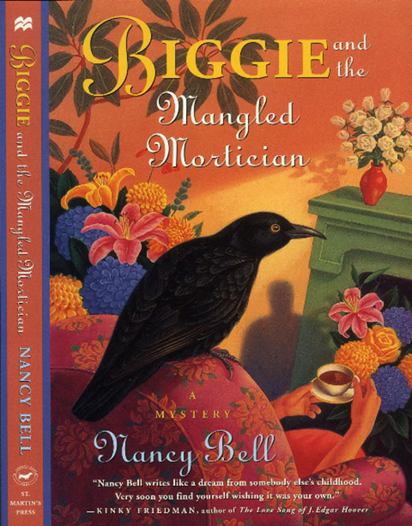
Ken Joudrey’s cover for “Biggie and the Mangled Mortician” attracts attention because of the context it creates. Motifs that cue the viewer that this is a mystery novel include the curious black bird sitting unexpectedly on a chair back, the surprising group of vases filled with flowers and the mysterious shadow lurking in the background. These elements also pique the viewer’s interest in the content of the story. The stylistic use of perspective, such as the off-kilter angle of the green fireplace, the angle of view that hides most of the woman behind the chair back and the jarring placement of the bird in extreme foreground, give a sense of foreboding. The bright, primary colors, countered by the dark shadow and black bird create a chromatic tension. All these devices signal that this is a mystery novel and entice the viewer to stop for a moment and discover what the book is about.
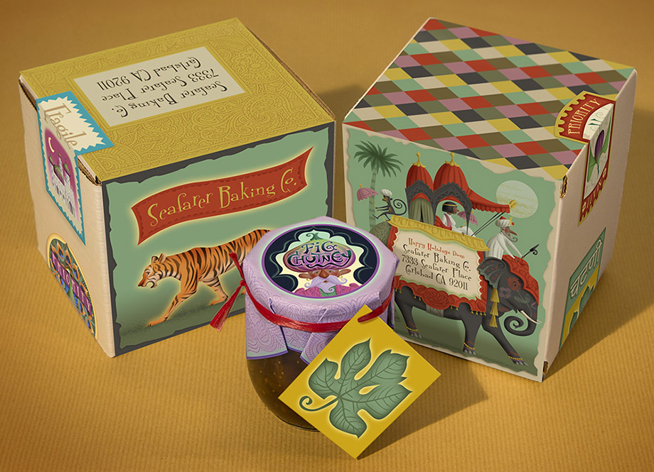
Context can be used to advantage in product design, as well. This label treatment I created for a limited edition of Fig Chutney uses the motifs of tiger, elephant, monkey and turbaned man to point to a commodity that originates from India. Fig shapes are used to define the turban on a man’s head, the bodies of birds and the domes of buildings.
The art style, while rendered playfully, makes reference to the clear delineation, penchant for patterns and flat perspectives of Indian manuscript paintings. The bright colors and simple gradations reinforce the connection to Indian art and bolster the playful intent. The goal here is to make the viewer curious about the product and perceive the “special edition” aspect of this project.
Lori Mitchell’s illustrations for “Different Just Like Me” create a context that reinforces the theme of her book – that we are each unique and valuable in our own right. She uses the motifs of ordinary, everyday situations to stress the universality of the message.
The sympathetic renderings of people and places make use of a warm, accessible style to reinforce the humanity inherent in our individual differences. The limited use of color, casting the environments in simple black a white line drawings but rendering individuals in full color shine a spotlight on the primary value of the individual.
One of the strengths of illustration is the ability to go immediately to the purest forms of motif, style and color. Ken Joudrey was able to render the extreme perspective distortions and purest primary colors possible, right from the conception of the illustration. I was able to combine fig shapes into the imagery in a visually organic way. Lori was able to selectively turn color on and off to focus attention on the themes of the book.
Whether used as book cover, package design, children’s book illustration, editorial image or advertising campaign, illustration has the power to instantly create a context for the content it illuminates.


Nice post Tracy!